Turning a visitor into a buyer requires sales tactics that mainly involves understanding human psychological behavior. In online businesses, we can hack the user’s brain activity by controlling their senses and calling out to their emotional appeals. An online visitor can’t become an online customer until he clicks on that all important button. That’s why CTA buttons are the most tested, experimented and evaluated elements of any ecommerce web design. These are definitely the most attention-grabbing element of any page that visitors notice and click.
Here we have listed the most important factors to consider when selecting the right color for your CTA button.
Color Psychology
What stands out will gain attention and what blends in will be missed.
Each color creates certain emotions and is associated with certain feelings that trigger shoppers’ minds. By testing different color variations you find the best color for your website’s call to action buttons.
As there is no definitive color that can claim to convert your visitors the best, but the extreme color contrasts leave no doubt in the users’ mind about the next thing they should do. While designing e-commerce web design, it’s essential to remember that online consumers take color and visual appearance more seriously than any other design element.
Color
One rule doesn’t work for everyone.
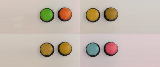
Red, green, yellow orange or blue; we can’t recommend any single color for every design. The rule of selection is it should not get lost with the background as it will not attract the user. The color should be in contrast with the background.
The ideal way is to select the color that is not used elsewhere on the page. It is crucial to remember that contrasting color draws eyes on it. If you want to draw attention to the button, the color is going to be the key.
What is the best color?
We have seen many ecommerce websites that tend to match their CTA button colors with their brand colors. CTA button color is not something that should blend into design or is selected only to look beautiful with the rest of the page design. It needs to stand out clearly. If the background color is blue and the button is in dark blue color, the CTA button will not be noticed and fail to attract the eyes.
The bright colors, like orange and green, have been seen to be more attention grabbing as compared to red and blue. These two colors catch the users’ eyes and are more welcoming and friendly. That’s why these colors are mostly used in the internet marketing for the most important buttons. But it doesn’t establish that green and orange colors are the very best for conversion. In many cases, blue and red did better than others. However, it all requires A/B testing to reveal what performs best for your particular situation.
Bright Color
The bright color always stands out.
Bright colors give out happiness and nothing is more important than the happy customers. That’s why bright colors are used in CTA buttons because they have psychological perspective and have profound impact on the user’s mind.
They instill online users to take action. Just like the real world, bright colors on the online world also create and change specific human feelings.
Contrast
It’s all about contrast; if you implement it you’re golden. Rather than getting inspiration from renowned brand colors, it’s better to test different highly contrasting colors that stand out on the background and surrounding colors. Hover state color helps the users knowing that they are moving their cursor on the right place.
White Space
White space can work in your favor, if you try to make it your friend on your web page. If CTA button is surrounded by empty white space, you can achieve a lot with your CTA buttons. This can be done by removing the elements surrounding the CTA button.
The other way is not to use too many bright colors on the page, when you have a CTA button there. Excessive use of colors also create confusion.
In Conclusion
The color itself makes no difference on its own. The thing that creates an effect is how it changes the visual hierarchy of the entire page. There is no best color for conversions. What works best on your competitor’s website may not work well on yours.
We are sure our today’s article will help you using right color for the right audience, and for the right purpose. Considering all the factors we’ve listed above is crucial in securing conversions.


